Project type
B2B, SaaS, Dashboard design
Timeline
Jun. 2022 - Sep. 2023
Team
May Chou | Product design lead
Chelsea Wang | Product manager
Tracy Hsu | UX design intern
Skills
UX Design
UX research
Interactive Prototyping
Usability Testing
Summary
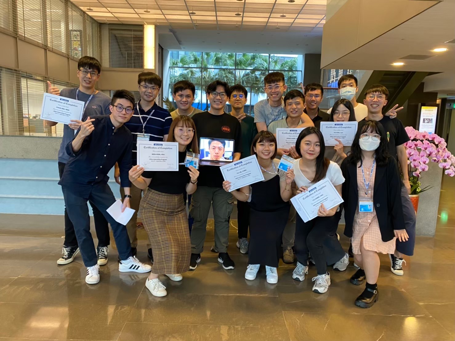
2022 Advantech Summer Internship and team mentors. We had such a fantastic summer working together!
As a product design intern , I…
🚀
Delivered the design in a 3 month rapid timeline
Prototyped high fidelity designs and presented to global executives
Worked with Advantech design system and proposed 15 design patterns
🔍
Identified and synthesized key user pain points
Synthesized research findings into actionable design opportunities
Conducted competitive analysis to identify market opportunities
🙌🏻
Collaborated with 5 global cross-functional teams
Worked with marketing, engineering, sustainability, GHG consultant teams
Communicated constantly with diverse stakeholders to align functions and values
Context
Organizations in Taiwan plan to reach net zero emission by 2050, but most of the companies don't know what to do…
Problem
Organizations don't know how to approach the complex regulations and carbon calculation process
Goal
Streamline data collection workflow to help users manage energy data efficiently
Impact
Reduced both communication hurdles and workforce strain through data-driven dashboard that transformed carbon verification with clarity
📈
Optimized operation time by 51%
🎯
Boosted 30% communication efficiency
🌐
Enhanced 40% data collection accuracy

Final Design
Final Design
Who are the users?

Data Collectors
Data collectors need to gather emission data from different units and communicate with managers

Sustainability Managers
Managers oversees energy performances across multiple units, and is in charge of usage managing and generating reports
"As a data collector, I want to record data quickly and precisely without needing to go over complex sheets and graphs."
Streamline data collection process
Simplify collection process through standardized user flow and centralized data library, reducing the communication costs between managers and data collectors.
✅ Easy-to-follow calculation forums, save time and boost efficiency!
"As a manager, I want a clear picture of the energy performance across various units, and find critical data easily to generate internal and external reports."
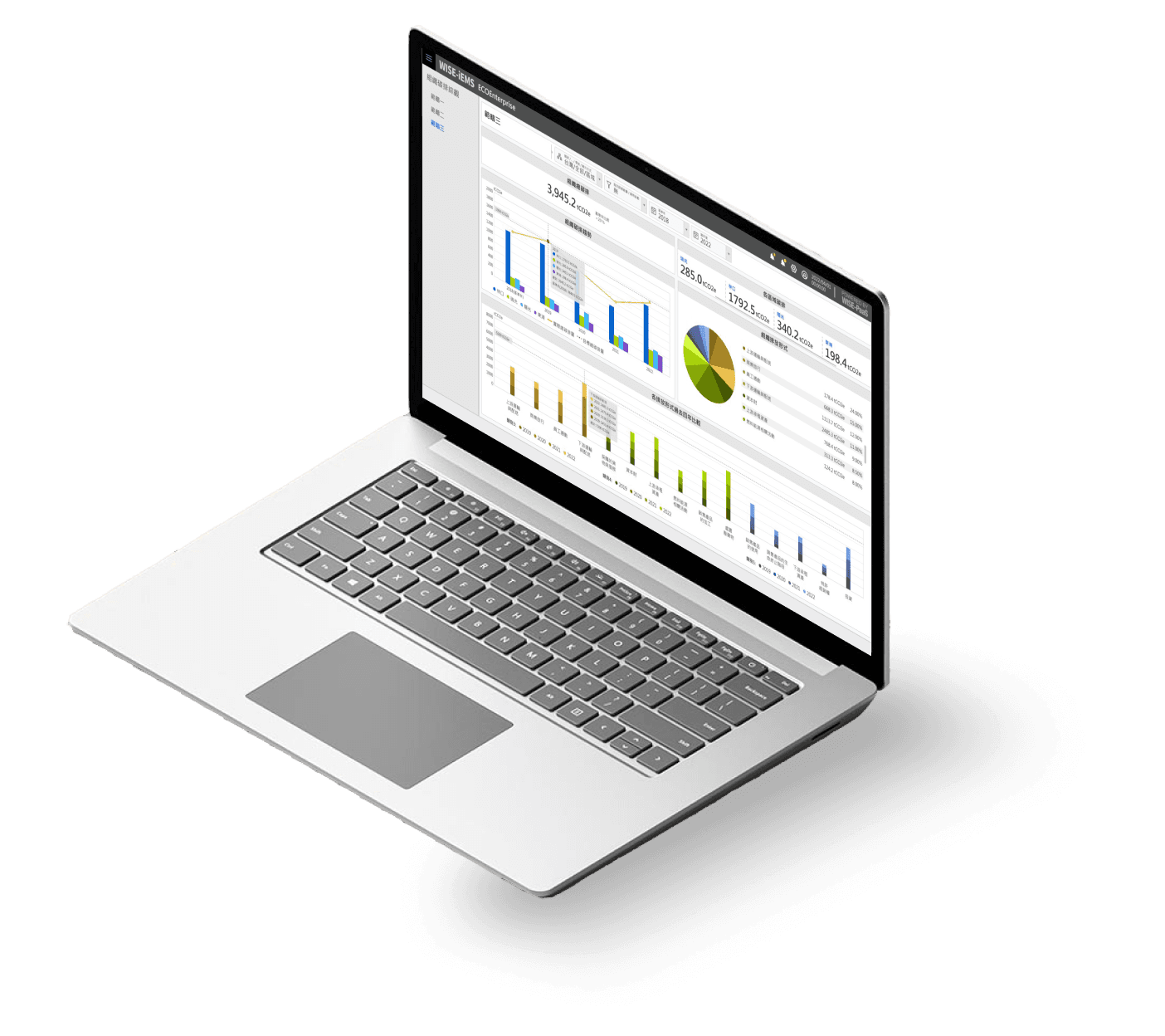
Robust front end dashboard for real-time data management
Visualize energy usage and fluctuation trends of operating units, offering critical insights to improve energy data transparency and management.
✅ Manage energy usage precisely through visual breakdown of emission performances

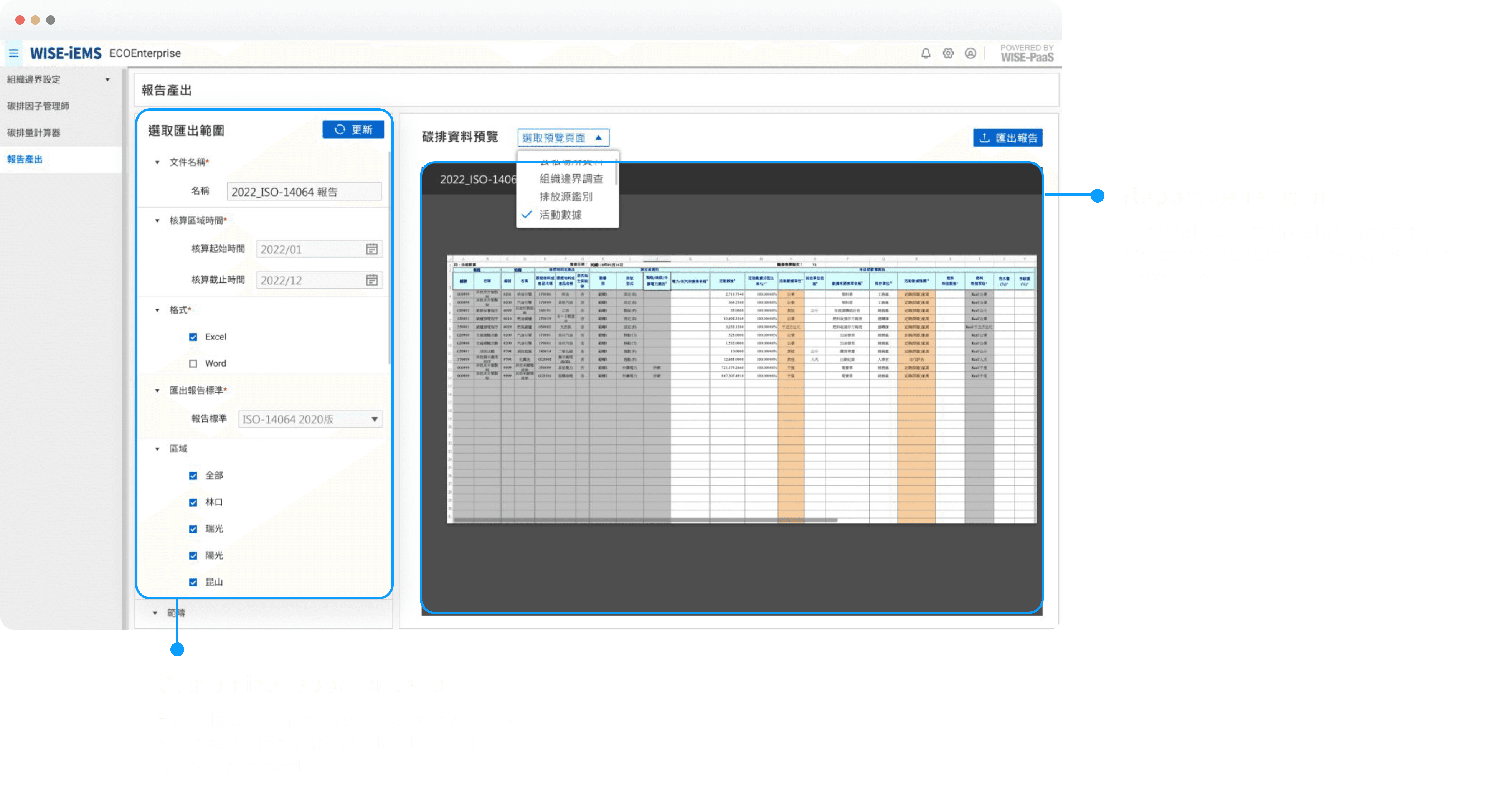
✅ Auto-generate report that fulfills various protocol standards
Research
Identifying gaps between the protocol and actual verification process
Through 2 rounds of user interview with 3 main target users, I identified the bottlenecks in the current carbon footprint verification process and critical gaps between the ISO-14064 protocol and actual verification process.

Key Insight
Current data collection process spend more time communicating than collecting!
User pain points & design opportunities
⌛
Calculating process is time-consuming and labor intensive
💡
Simplify Calculation
Our solution should provide a simple and efficient calculation process where workers of all professional levels can easily adapt to
🔍
"Searching for historical data is like searching for a needle in hay!"
💡
Data Centralization
Our solution should help users organize data in a systemic way and find targeted data easily when needed
📝
Complex report standards makes the processing time 3x longer
💡
Report Automation
Our design should streamline complex report standards to reduce processing time while maintaining accuracy and compliance
Bringing ideas to life.
Design Solution
6 scattered functions ➡️ 1 streamlined process
Our design strategy evolved into an integrated front and back-end dashboard system that seamlessly guides our critical users through 6 key stages of the carbon inventory process.

Wireframe + A/B Testing
How data visualization makes sense to our users?
Throughout the wireframing process, I conducted A/B testing with GHG specialists and the Energy Management team at to refine the dashboard layout, creating multiple design patterns to assess the feasibility and effectiveness of each version.

Dashboard structure 1.0
Data presentation that matches directly mirrors ISO-14064 protocol

Dashboard structure 2.0
More specific breakdown informations that are essential for actual use cases

✅ Dashboard structure 3.0
Further breakdown of data that abstracts vital insights
Design Strategy
Visual hierarchy that compliments user's workflow
Workflow of data managers
Step 1
Total emission data observation
Step 2
Trend overview observation
Step 3
Detailed data management

Design Iterations & Testing
3+ critical design reviews helped shape a user centric experience
Feature iteration 1
Prioritize core metrics on graphs to meet actual use cases
I refined the interface by adding essential components and removing unnecessary features to bridge the gap between the ideal data collection process and practical implementation, ensuring our design meets actual user needs.
Approach 1
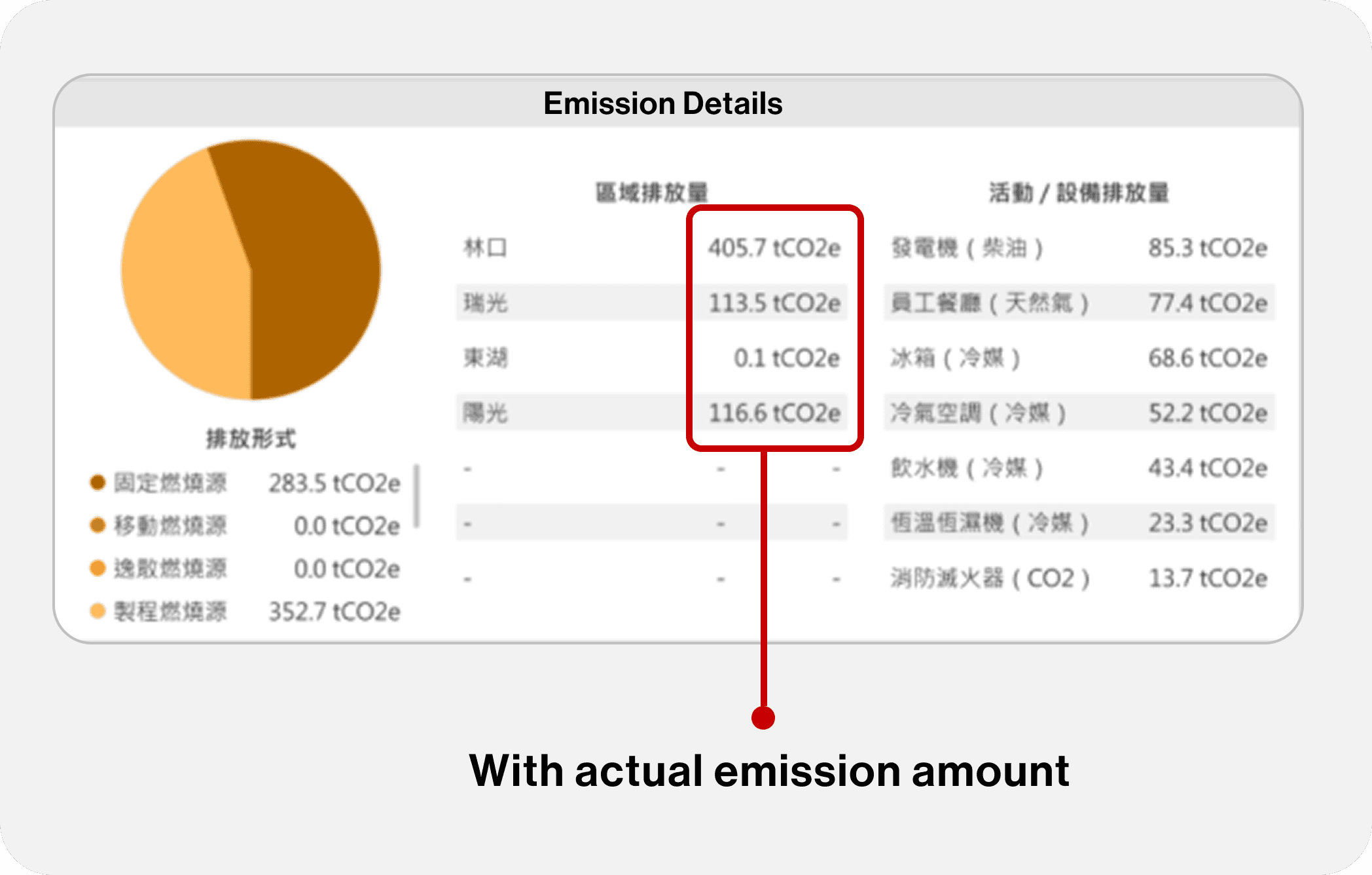
Emission details focused on exact numbers under each regulated areas
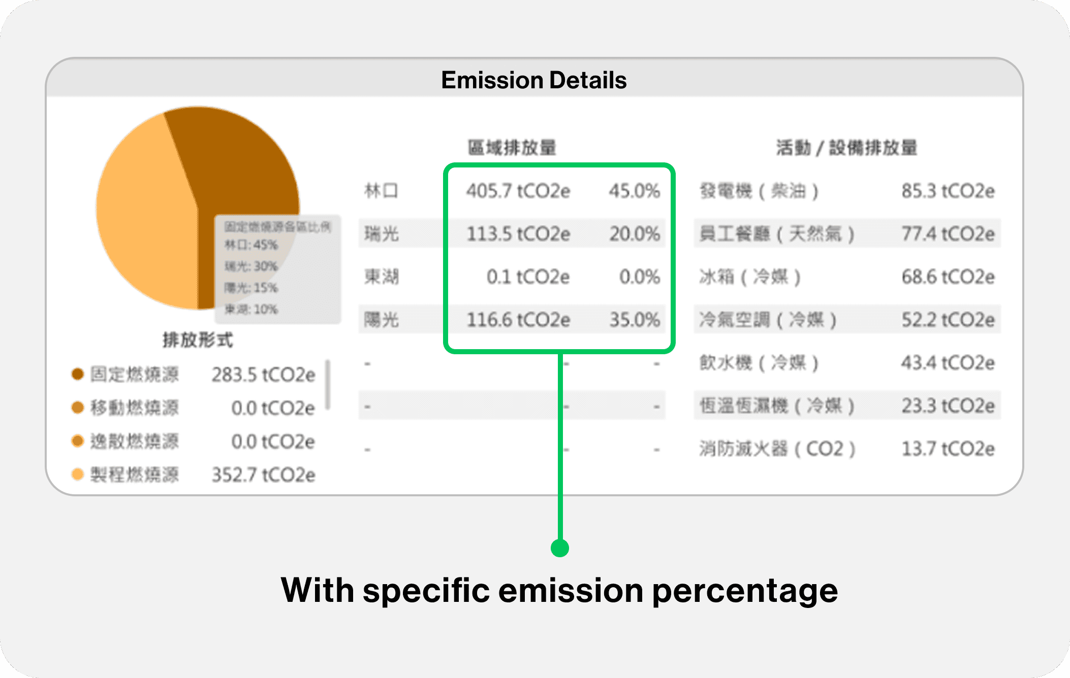
✅ Approach 2
Adding percentage of emission in the regulated area to help regulators clearly identify and compare the consumption rate

Approach 1
Carbon emission intensity broken down by individual operating areas often resulted in irrelevant data

✅ Approach 2
Eliminates unnecessary details from areas with incomplete data, offering a more streamlined and relevant overview
Feature iteration 2
User-centric function alignment
On top of the basic structures, I added specific features such as data filters and template selection that can further boost efficiency and ensure communication alignment for our users.
Data collectors need to locate specific data from exported data during regular checkups
Data filter & Search bar
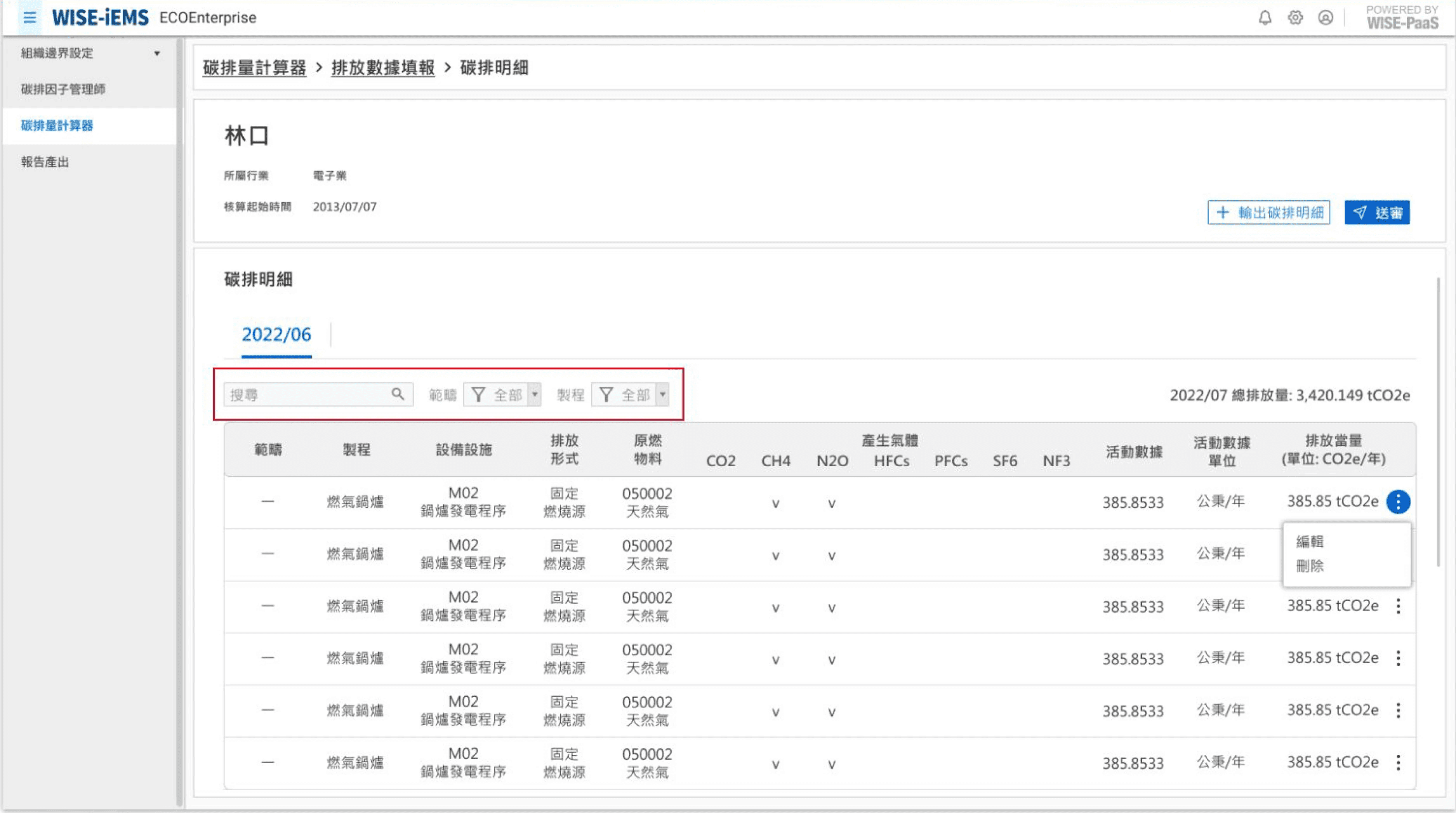
Managers need to fulfill various report protocols for internal and external use
Report template selection

Design Challenges
What challenges did I encounter as designer 👀?
And how did I solve it?
I was challenged many times with function alignment across multiple stakeholders, including company CEO, engineers, and our target users. To solve this, I visualized data and flows to ensure clear communication, and that every decision is made with a purpose that brings maximized value.
Impacts
"From 3 days of work to under 3 hours!"
Our design undergone a pre-launch testing and is now implemented in real world scenarios. I am proud to say that our design has marked a milestone enterprise solution for energy management in the industry!
📈
improved operational efficiency during pre-launch testing.
🌐
in Taiwan headquarters and overseas branches are currently implementing the solution.
Looking back
A Quick Recap
Pain Points
Complicated calculation process
Specific emission factors
Excessive communication cost
Complex report protocol
Solutions
Streamlined and automated calculation workflow
Customizable emission factor library
Centralized dashboard
Report generation template
Reflection
Empower the ability to tackle social challenges through design!
✨
Ask Questions! Approach Complexity with Clarity
Over the three-month internship, I learned the importance of "asking the right questions", especially when working with a topic as complex as enterprise energy management. In addition to that, me and my partner Tracy mapped out a clear roadmap and database from the start to track our progress and consistently aligned with the project manager.
🍎
Sometimes inspirations come from a chat during lunch!
One of the highlights of this experience was connecting with an amazing group of interns from diverse backgrounds. I especially enjoyed exchanging ideas with my peers and receiving feedback from different perspectives—it was one of my favorite aspects of the internship!